Overview
Stop juggling spreadsheets across 5 different property managers. See all your properties in one unified dashboard—occupancy rates, delinquency, revenue, NOI, and lead performance at a glance. Compare properties side-by-side, identify winners and losers instantly, and increase portfolio-wide NOI margins by 15-25% through better capital allocation.
Full Content
Transform Portfolio Management from Chaos to Clarity
Stop juggling spreadsheets and fragmented reports. Get instant visibility across every property in your portfolio—all in one unified dashboard.
Identify winners and losers at a glance. Know exactly where to invest capital, where to cut costs, and which properties need attention—today.
Portfolio-wide optimization tools help you increase NOI margins by 15-25% through better capital allocation and performance benchmarking.
Getting Started
1️⃣ Connect Your Property Management Systems Link all your PMS platforms—Yardi, RealPage, AppFolio, Entrata, or any combination. We handle multiple systems simultaneously, so each property manager can keep using their preferred tools.
2️⃣ Import Your Portfolio Data We automatically pull in all properties, units, financial data, and historical performance metrics. Setup typically takes 15-30 minutes per property.
3️⃣ Configure Your Views Customize which KPIs matter most to you. Set up property groupings (by region, vintage, or asset class), establish performance thresholds, and configure alerts.
4️⃣ Start Making Better Decisions Day one: See your entire portfolio at a glance. Week one: Identify which properties need attention and which are performing well. Month one: Make your first data-driven capital allocation decision with complete confidence.
The Problem You’re Facing Right Now
If you’re managing a multifamily portfolio, you know the pain:
🔴 Spreadsheet hell: Cobbling together data from 5 different property managers’ reports
🔴 Delayed insights: Finding out about problems weeks after they started
🔴 No comparisons: Which property is actually performing best? You’re guessing.
🔴 Investor pressure: Scrambling to pull reports together for quarterly board meetings
🔴 Capital allocation anxiety: Which property deserves that $500K CapEx budget?
Sound familiar? There’s a better way.
Your New Reality: The Portfolio Dashboard
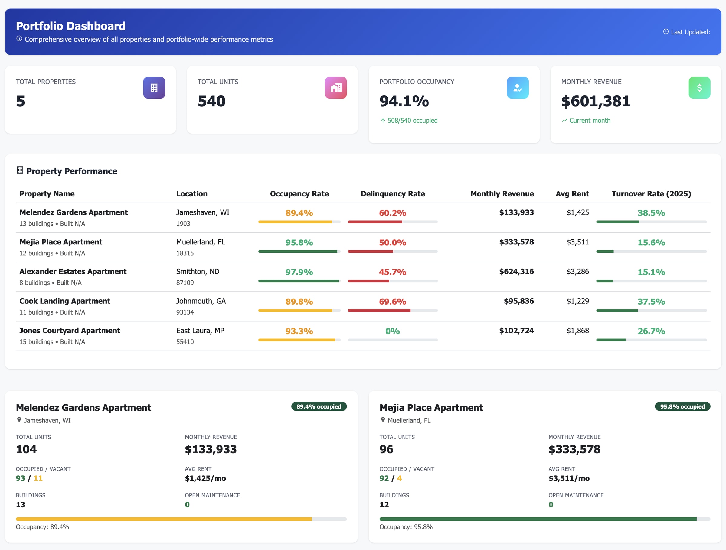
At-A-Glance KPIs
Portfolio-wide metrics that matter:
Occupancy Rates
Delinquency Rates
Monthly Revenue
Turn over rate
Updated in real-time from your PMS
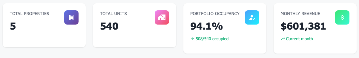
Leads Performance
Instantly see:
Total leads
Total tours
Conversion rate
Top lead sources
Color-coded alerts so nothing slips through
Geographic Intelligence
Visual heat map shows:
Property locations & performance
Market concentration risks
Expansion opportunities
Regional trends
Interactive map with click-through details
Real Results: Before & After
Metric |
Before Portfolio Dashboard |
After 6 Months |
|---|---|---|
Time spent on reports |
12 hours/week |
2 hours/week |
Problem identification speed |
3-4 weeks lag |
Real-time alerts |
Portfolio NOI margin |
38% |
44% |
Investor satisfaction |
"Where's the report?" |
"Best reporting we've seen" |
Capital allocation confidence |
Gut feel + prayers |
Data-driven decisions |
Features That Drive Results
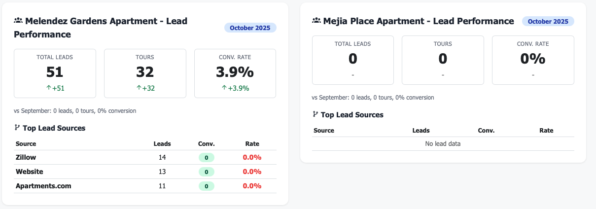
📊 Comprehensive Property Comparison Table
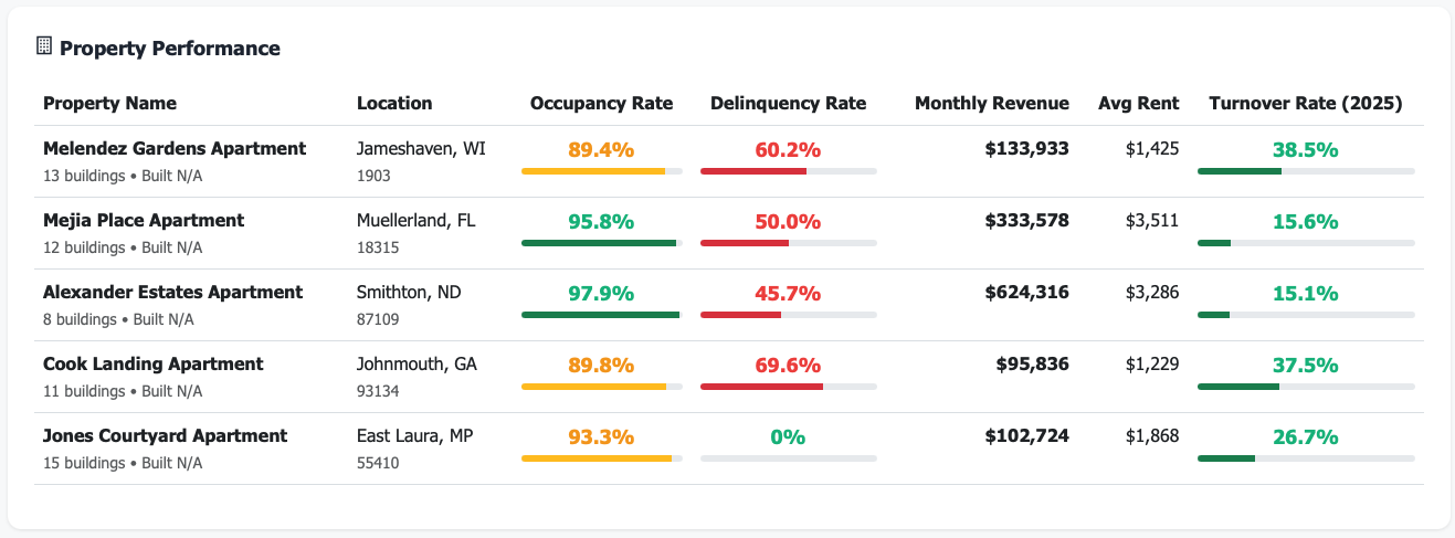
Compare all properties side-by-side across 15+ metrics. Sort by occupancy, NOI, revenue, expenses, or any KPI. Click any property to drill into detailed performance.
📈 Powerful Visualizations
Occupancy trends over time (spot seasonal patterns)
Revenue distribution by property (identify concentration risk)
NOI waterfall charts (see each property’s contribution)
Expense analysis by category (find optimization opportunities)
💰 Automated Financial Roll-Ups
Aggregate income statements across all properties. See revenue, expenses, and NOI by property—or by custom groups (region, vintage, property type).
🎯 Smart Alerts & Notifications
Get notified when:
Occupancy drops below your threshold
NOI turns negative or declines
Expenses spike unexpectedly
Lease expirations threaten occupancy
Perfect For
Portfolio Owners
Make confident investment decisions with complete visibility into portfolio health and property performance
Asset Managers
Optimize capital allocation, identify risks early, and demonstrate value to investors with professional reporting
Regional Managers
Oversee 10-50+ properties efficiently, benchmark performance, and deploy resources where they’ll have maximum impact
Technical Integration (It’s Actually Easy)
Pricing That Makes Sense
Portfolio Size |
Investment |
What's Included |
|---|---|---|
**2-5 properties** |
$299/month |
Everything: Unlimited users, all integrations, automated reporting, mobile access |
**6-20 properties** |
$599/month |
Everything + priority support |
**21-50 properties** |
$999/month |
Everything + dedicated success manager |
**51+ properties** |
Custom pricing |
Enterprise features + white-glove service |
Steps to Getting Started
1️⃣ Connect Link your property management system (OAuth or API key). Takes 15 minutes.
2️⃣ Import We automatically pull in all your properties, units, and historical
3️⃣ Optimize Start making data-driven decisions from day one. See your entire portfolio at a glance.
Frequently Asked Questions
Q: How many properties do I need to get value? A: Minimum 2 properties. Maximum value with 3+ properties for meaningful comparisons.
Q: What if each property uses a different PMS? A: No problem. We support multiple PMS integrations simultaneously. Mix and match Yardi, RealPage, AppFolio—whatever you use.
Q: Can my investors access the dashboard? A: Absolutely. Create read-only investor accounts with custom permissions. They see only what you want them to see.
Q: How long does setup take? A: Most clients are viewing their first dashboard within 2 weeks. Simple portfolios can be live in days.
Q: Do you offer a free trial? A: Yes! 14-day free trial with full access to all features. No credit card required.